About the project
3it Ltd is one of Bury St Edmunds’ longest-established managed IT firms — based at The Sugar Barn on Heath Farm Business Centre, serving businesses across East Anglia including Ipswich, Newmarket, Cambridge and the wider Suffolk and Norfolk region. Their combined team has more than 40 years’ experience across IT consultancy, cloud services, support, and cybersecurity. They’re also, unusually, an accredited AAT assessment centre — hosting on-site accounting exams alongside the day job of keeping local businesses running.
They came to us with a specific problem: the existing website (a Wix-based build stitched together over the years) no longer reflected the calibre of the business behind it. The service was strong, the client base was loyal, the reputation was solid — but the site felt dated, slow, and generic. New enquiries were being routed through channels the site wasn’t built for, and the AAT Assessment side of the business was almost invisible online.
We were brought in to deliver a full digital refresh: a proper hand-coded custom website, a sharpened brand identity for the digital space, and a build that would carry 3it comfortably through the next five to ten years.
The challenge
Three specific problems to solve.
First, the credibility gap between the business and its website. Established B2B IT firms live and die by trust signals — and prospects arriving at the old site had no way to feel the depth of experience the business actually had. Certifications, service breadth, response guarantees, real-people-not-tickets philosophy — all of it needed to come through in seconds, not paragraphs.
Second, the two audiences problem. 3it serves two very different constituencies: business decision-makers looking for IT support, and AAT candidates booking on-site accounting assessments. The old site treated the second audience as an afterthought, buried behind menus. The new build needed to serve both without either feeling secondary.
Third, the quick actions problem. A meaningful share of existing customers arrive at the site not to browse services, but to grab a ScreenConnect remote support session, download the Mac or Windows support agent, or get straight through to a real person on the phone. Those quick-action journeys had to be immediate — visible above the fold on the homepage, not hidden three clicks deep.
Our approach
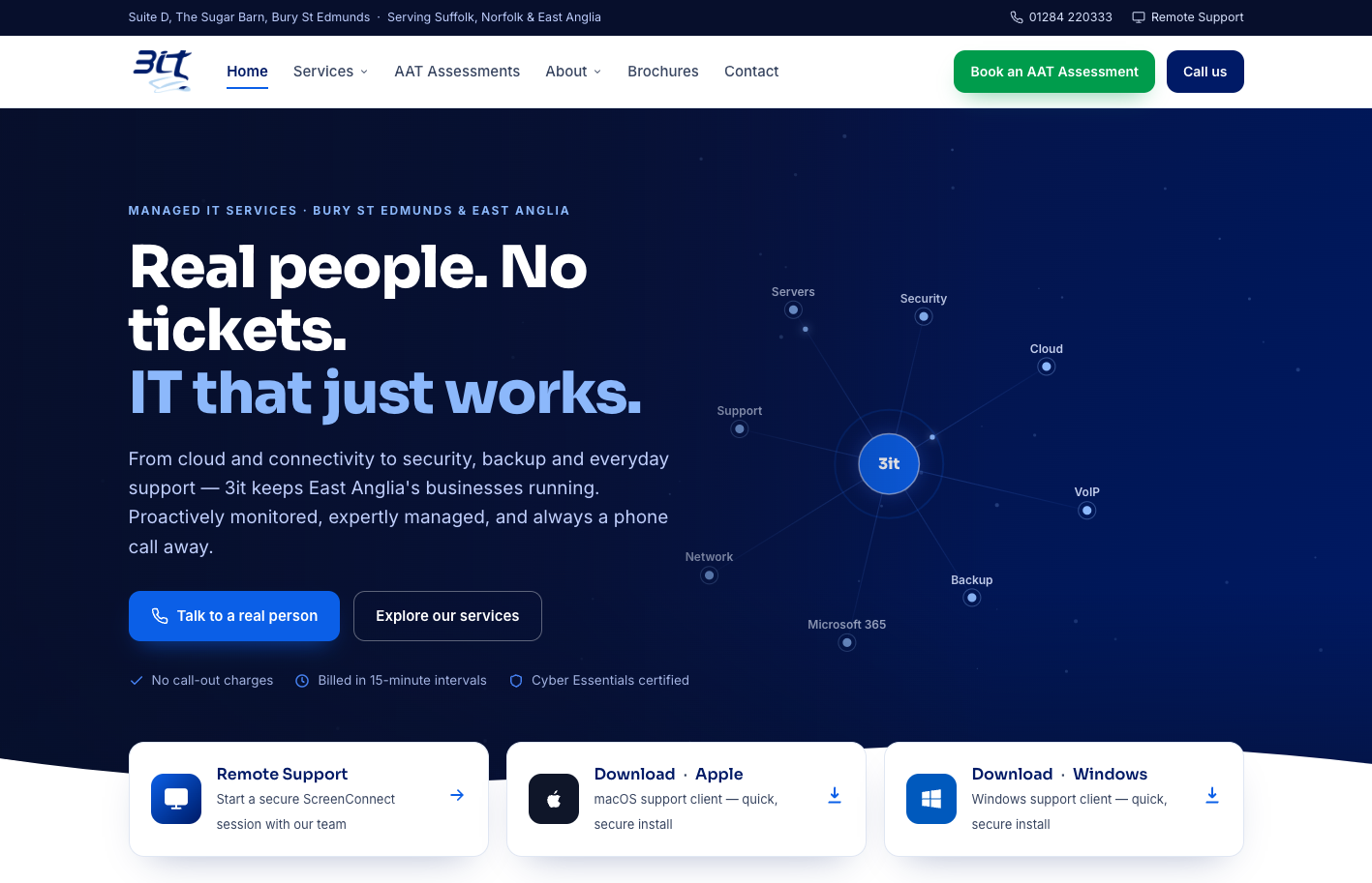
We started with positioning. The old site tried to say everything at once — a scrolling list of services, features and product logos. The new site leads with a single strong claim: “Real people. No tickets. IT that just works.” Below it, a plain-English service description that puts humans first, tickets second, and technology third. That one shift did more for perceived credibility than any amount of design polish would have on its own.
The visual direction landed on a confident dark-navy palette with a bright electric-blue accent — drawing on the brand’s existing colour equity but modernising the treatment considerably. Bold sans-serif display type for headline claims, clean sans-serif for body copy, and a distinctive interactive service diagram in the hero — radiating spokes for Servers, Security, Cloud, Support, VoIP, Backup, Microsoft 365 and Network — that communicates the breadth of what 3it does in one glance rather than the fifteen paragraphs the old site needed.
Information architecture was rebuilt around the two-audience problem. AAT Assessments got its own top-level navigation slot and its own prominent green “Book an AAT Assessment” CTA sitting alongside the primary “Call us” button in the header. Two audiences, two doors in, no ambiguity. Immediately below the hero, three quick-action cards give existing customers direct routes to Remote Support (ScreenConnect), the macOS support client download, and the Windows support client download. Business decision-makers see positioning first, services deeper down the page; existing clients get straight to the tools they need.
Trust signals moved from the About page onto the homepage itself — “No call-out charges,” “Billed in 15-minute intervals,” and “Cyber Essentials certified” sit as a compact row directly under the hero CTAs, doing real work on prospect perception without adding visual clutter.
What we delivered
- Full custom website design — hand-coded from scratch, not built on a page builder, not a themed template
- Modernised digital brand identity — refreshed colour palette, type system, iconography, and interactive hero element that carry the brand forward while respecting its existing equity
- Dual-audience navigation — parallel top-level entries for Managed IT Services and AAT Assessments, each with their own optimised journey and prominent CTA
- Interactive services diagram — hero element that communicates the breadth of 3it’s service offering (Cloud, Support, Servers, Security, VoIP, Backup, Microsoft 365, Network) in a single visual
- Quick-action support panel — direct-link cards for Remote Support, macOS support client, and Windows support client immediately below the hero — keeping existing customers’ day-to-day journeys friction-free
- Trust signal row — No call-out charges, 15-minute billing, Cyber Essentials certified — hard-earned differentiators positioned to do the work on the homepage where they belong
- Full service architecture — dedicated pages covering the full range of 3it’s work: consultancy, remote and onsite support, proactive monitoring, cloud services (VoIP, Microsoft 365, secure backup), hosting, security (antivirus, email security, MFA, disaster recovery), structured cabling, hardware procurement, repairs and data recovery
- AAT Assessments micro-site — dedicated area for the accounting assessment training centre with its own booking flow, exam information, and centre details
- Downloadable brochures — a proper library for the PDF collateral 3it’s sales team relies on, previously scattered across the old site
- Meet the Team page — putting real names and faces to the “real people, no tickets” positioning — visitors can see who they’ll actually be talking to
- Testimonials page — existing client feedback organised properly rather than buried in footer strips
- Mobile-first responsive build — engineered for phones and tablets first, scaled up for desktop
- Fast Core Web Vitals — hand-coded means no Wix bloat; the site loads dramatically faster than the previous version and scores well on Core Web Vitals from day one
- UK-hosted infrastructure — SSL, automated backups, GDPR-compliant contact handling, ready to grow with the business
- SEO foundations — proper structured markup, service schema, geo-targeting for Bury St Edmunds, Ipswich, Newmarket, Cambridge and the wider East Anglia region, and a clean sitemap for search-engine discovery
See it live
The new 3it Ltd website is live — visit to see the full build, explore the service breadth, and see how AAT Assessments and Managed IT sit alongside each other in the same coherent brand.
Why it works
Most B2B IT firms’ websites fall into the same trap: too many words, too many product-partner logos, too much technology-first language. The prospect arrives, reads three paragraphs of “we deliver enterprise-grade cloud and hybrid infrastructure solutions,” realises they still don’t know if this firm is human enough to pick up the phone when things go wrong, and leaves.
The 3it site avoids that trap by doing three specific things differently. First, it leads with a human claim (“Real people. No tickets.”) rather than a technology claim — positioning the firm on service philosophy before service breadth. Second, it demonstrates the breadth visually (the interactive services diagram) rather than reciting it. Third, it treats existing customers with respect — the quick-action cards for Remote Support and support-client downloads acknowledge that not everyone landing on the homepage is a prospect. Some are customers with an immediate need, and their journey matters just as much.
The dual-audience treatment is the other quiet win. AAT Assessments is a small but genuinely differentiated part of the business — a rare thing for an IT firm to also be, and worth its own visible route through the site. Putting it on the top-level nav alongside a distinct green CTA in the header means the AAT audience never has to hunt for it, and the managed-IT audience doesn’t get in their way. Two paths, one coherent brand.
Could we build your next site?
Jabu Designs is a website design, software development, and design and print agency based in Bury St Edmunds. We work with B2B professional services firms — IT companies, accountants, consultants, solicitors — across Suffolk and the wider UK on modernisation projects like this one. Alongside website design and website development, we offer brand identity, bespoke software development, SEO, and hosting — making us a genuine one-stop digital partner for established Suffolk businesses looking to move on from legacy platforms.