
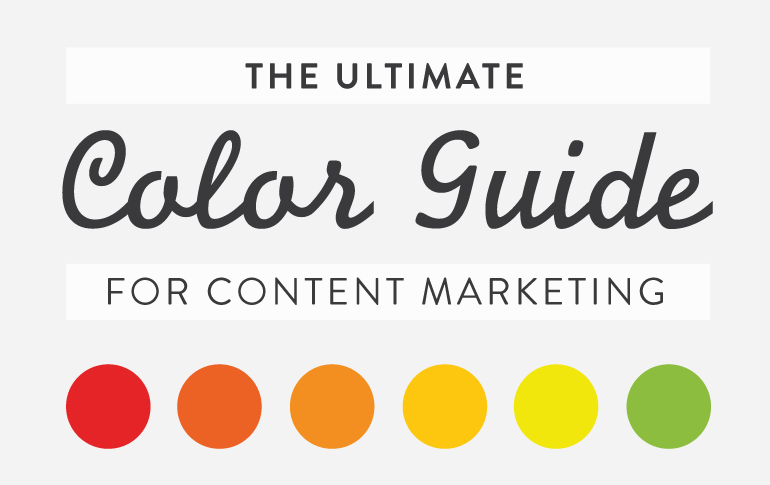
The ultimate colour guide.
For content marketing, colour is a cue.
Colour is a cue that gets your audience to see what you want them to see, feel what you want them to feel, and to do what you want them to do. How you use colour also affects the usability–whether they can read it or not–of your content.
Colour can change your message. Choose poor colour choices, and your great content and your amazing call to action (CTA) are ignored.
The Basics Of Colour Theory
Understanding how colour works isn’t just for artists dipping their hands into paint and pigments all day long. Anyone using content marketing needs to understand the basics of Colour Theory, because you are using colour in your content.
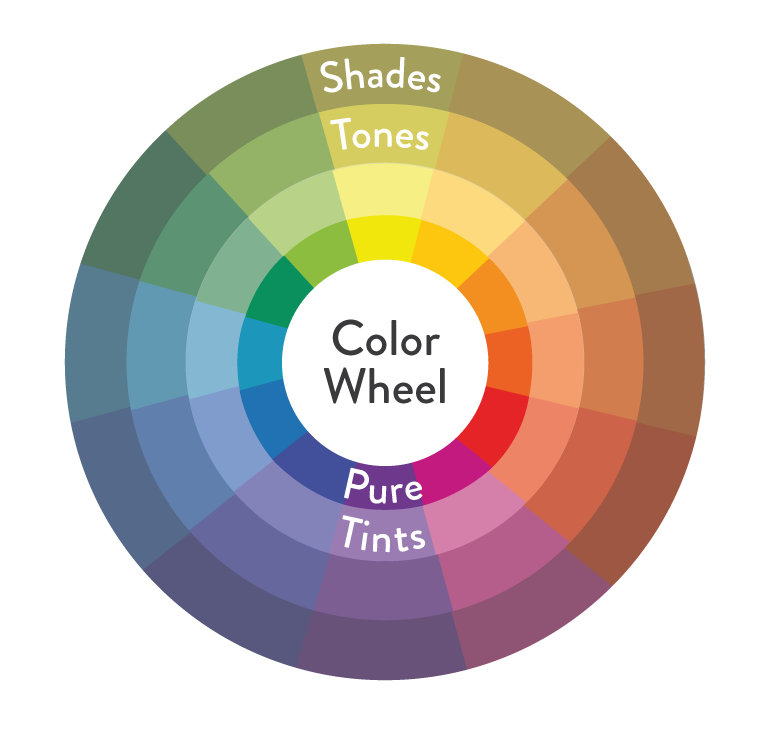
Primary colours are the three colours we need to make all other colours. They are red, blue, and yellow. These three colours can be used to create the next level of colours, called the secondary colours.
Secondary colours are purple, green, and orange. They are created using the primary colours. If you look on the colour wheel, you’ll find the secondary colours in between two primary colours.
red + blue = purple
blue + yellow = green
red + yellow = orange
Tertiary colours are taking secondary colours one step further. They are the “two-name” colours, such as red-purple, red-orange, yellow-green, etc. They are created by adding more of one primary colour than the other, creating not a true secondary colour but instead, one that is found closer to the primary colour.
Pure Colour – Primary, secondary, and tertiary colours, without the addition of white, black, or a third colour, are pure (or saturated) colours. They are intense, bright, cheery, and untainted colours. These are the colours of children’s toys, daycare decor, and summer clothes.
Tints – When white is added to a pure colour, you create a tint. Some people refer to these as pastel colours. They are lighter and paler than a pure colour, and not so intense. Tints range from slightly whiter to almost-white.
Shades – When black is added to a pure colour, you create a shade. These darken and dull the brightness of pure colours, and range from slightly darker to almost black.
Tones – When gray (black + white) is added to a pure color, you create a tone. You often hear people saying that a colour needs to be “toned down”, meaning it’s too intense and they want to drop the level of intensity. Adding black and white in different amounts to a colour subdues the intensity quickly.
The Completed Colour Wheel
So here we have it: a complete colour wheel with primary, secondary, and tertiary colours, plus their tints, shades, and tones. You can see how it all fits together on the colour wheel below.
On the left side of the wheel, in the blues and greens, you have cool colours. On the right side of the wheel, in the yellows and reds, you have warm colours.
Now that you understand colour theory and the colour wheel, you can start to use colour purposefully in your content marketing.
Choosing colour Combinations
The colour wheel can help you choose great colour combinations for your your call to action button, your infographics, or your lead collection pop-up.
Keeping your colour combinations simple will help you in the long run.
People like simplicity; it makes your content easier to understand if they don’t have to interpret it through many colours. Remember, colour has meaning, too. It adds to your message. Too many colours make for a confusing message. So how do you choose those 2 or 3 colours? The colour wheel can help.
Using Complementary (Opposite) colours
Complementary colour combinations make things stand out.
Complementary colours are “opposite” colours. They are opposite of each other on the colour wheel, meaning the one colour they lack is that one opposite of them. They are geographically and colour-wise the opposite. They provide a kind of visual tension because they are so opposed to each other.
Blue is the opposite of orange.
Red is the opposite of green.
Yellow is the opposite of purple.
Opposites attract! When the human eye sees a painting full of different kinds of greens, any bit of red is going to stand out amazingly well. Why?
Red is the opposite colour of green. When the eye has been looking at a lot of the same colour, it wants to see the opposite. Using complementary colours is the easiest way to get something to stand out, but you have to use them carefully to keep your content from being visually jarring. You don’t want 50% orange and 50% blue, for example, because neither colour wins and it makes eyes hurt.
Using Analogous Colours

Analogous colours sit next to each other on the colour wheel. They are “related”, a kind of family of colours that creates pleasing and relaxed visuals. They aren’t jarring, opposite, or clashing. They also don’t stand out from one another. Analogous colours can create subtle and beautiful content, but you may need to use a complementary colour to get any particular item to stand out.
Using Monochromatic Colours
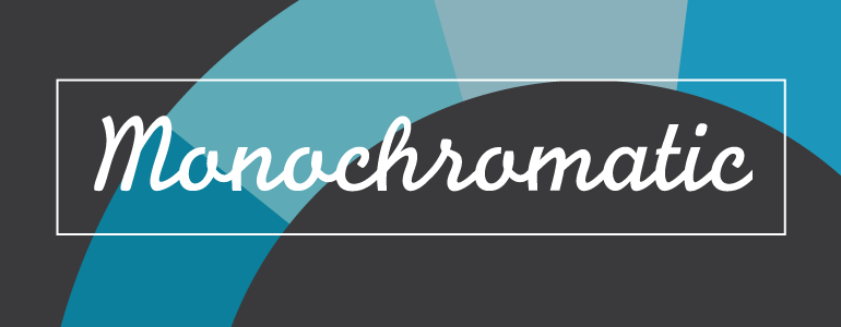
Monochromatic colours are a single colour, and its tints, shades, and tones. They are even more soft and subtle than analogous, being a colour palette based on one single colour. Monochromatic colours work great when paired with a single complementary colour.
Most designers, when using complementary colours, pair a rich collection of monochromatic colours with a single complementary colour.
Using Triangle, Rectangle And Square Colours
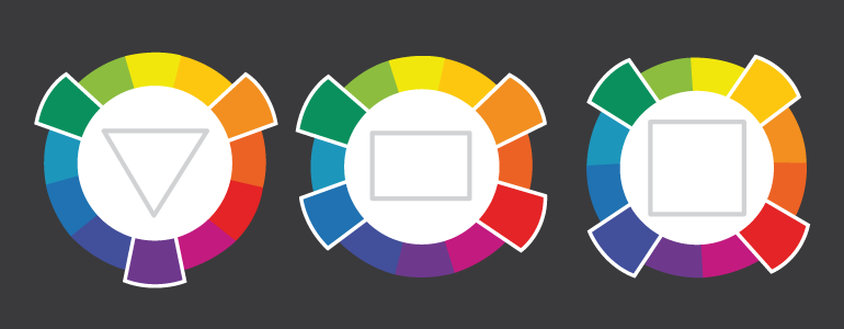
Creating color combinations that stretch the boundaries of the easy power of complementary opposites and the related analogous and monochromatic palettes isn’t difficult. All you need is a triangle, rectangle, and a square.
A triangle (triad) is a colour combination made of three colours that are evenly spaced around the color wheel.
A rectangle (tetradic) is a colour combination made of four colours that are made up of two complementary pairs.
A square is similar to a rectangle palette, but the two sets of complementary pairs are colours evenly spaced around the circle.
These three combinations can be visually noisy if you’re not careful. The best application is to use one colour as the dominant colour, and the others for highlighting content. The triangle combination is particularly vibrant; three is a “stable” number and using three colours is visually stabilizing.
The Psychology Of Colour In Marketing
Colour has an impact on how we think and behave. Colour directs our eye where to look, what to do, and how to interpret something. It puts content into context. It helps us decide what is important and what is not. That’s precisely why, as a business owner, you need to understand what colours do to people.
The psychological impact of colour is subjective. We don’t all react the same way to colours. There are a few generalities about how people respond to colour and that’s what we’re going to look at.
Colour Has Emotional And Cultural Meanings
How we interpret the emotional value of colour depends upon our language, senses, and personality characteristics, making it difficult to predict reaction to colour across a large audience of unique people.
Specific colour Influences
There are a few generalized understandings of what specific colours often mean to a large cross-section of people, with each colour having negative and positive emotions associated with it.
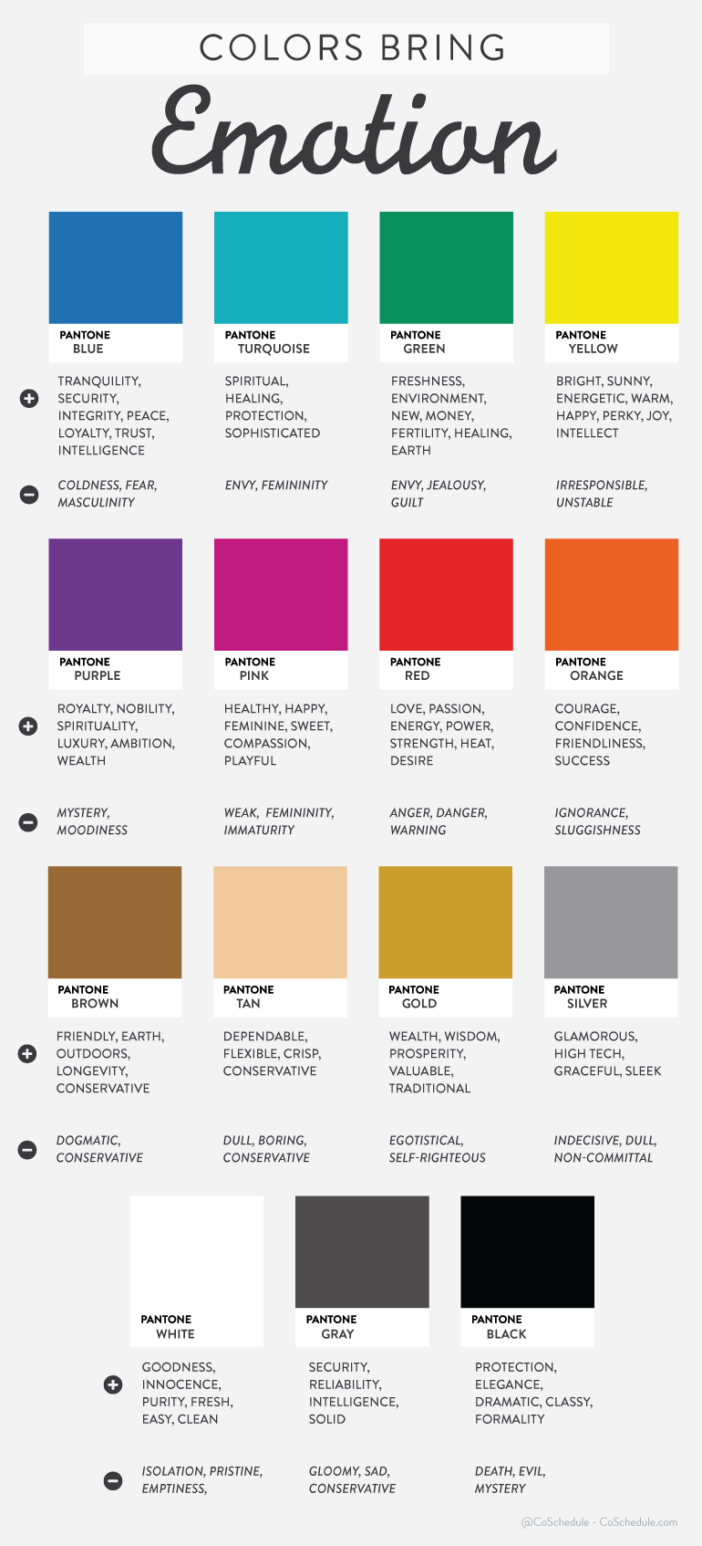
In a survey, people were asked to choose the colour they associated with particular words.
Trust: Most chose the colour blue (34%), followed by white (21%) and green (11%)
Security: Blue came out on top (28%), followed by black (16%) and green (12%)
Speed: Red was overwhelmingly the favorite (76%)
Cheapness: Orange came first (26%), followed by yellow (22%) and brown (13%)
High Quality: Black was the clear winner (43%), then blue (20%)
High Tech: This was almost evenly split, with black the top choice (26%) and blue and gray second (both 23%)
Reliability: Blue was the top choice (43%), followed by black (24%)
Courage: Most chose purple (29%), then red (28%), and finally blue (22%)
Fear/Terror: Red came in first (41%) followed by black (38%)
Fun: Orange was the top choice (28%), followed closely by yellow (26%) and then purple (17%)
Blue is clearly a colour people are positively drawn to, but beyond that, little else can be said.
Depending upon the context of the rest of your content, black can mean high quality and trust, or it can mean fear and terror. It can’t do it on its own, but surrounded by your content, a colour choice can bump up your intended meaning a notch.
Blue is one of the most preferred colours, with the most positive connotations.
Men And Women Experience colour Differently
Compiling the results of many studies, the Kissmetrics blog came up with an excellent infographic on how men and women experience and react to colour differently. Men and women have different colour preferences.
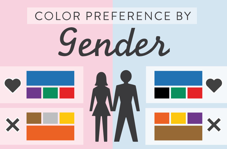
According to both the Kissmetrics blog and Hallock:
- Blue is the favored colour by both men (57%) and women (35%), though it is more heavily favored by men.
- Men dislike brown the most, while women dislike orange the most.
- Colours that were disliked were also seen as “cheap.”
- Men tolerate achromatic colours (i.e. shades of gray) better.
- Women preferred tints while men preferred pure or shaded colours.
- A majority of men (56%) and women (76%) preferred cool colours in general.
- Orange and yellow grow increasingly disliked as both genders get older.
- Women see more colours than men, generally. They are more aware of slight colour differenceswithin a colour range.
This may explain why men simply call the colour blue…blue. Women, on the other hand, see cerulean, pthalo, sky, teal, turquoise, and all sorts of varieties of blue. Perhaps it is a combination of being able to visually see more differentiation and considering it worthy of a more specific name. Perhaps men are better able to tolerate both colourless and bright colour palettes because they aren’t as sensitive to the nature and nuances of the colour as women seem to be.
What does this mean for you?
Well, is your audience mostly men or is it women? What age are they? Do the colours you’re using in your content marketing attract or repel that audience? If your audience is women, in particular, you must carefully choose colours that are not too raucous. If you are selling a luxury product, you want to avoid colours that are seen as cheap.
Colour Affects Conversions
How people behave when they see colour has a direct effect on your conversions. Will they click the button on your CTA? Will they read your pop-up graphic? Will they notice your email subscription box?
According to the Institute for colour Research, people make a judgment about your content in 90 seconds or less. And, up to 90% of that judgment in that brief amount of time is influenced by the colours they see. Blogger Neil Patel gives further proof of how colours affect your conversion rate, revealing that 85% of consumers base buying decisions on colour, and that full-colour ads in magazines get recognized 26% more often than plain old black and white ads.
In fact, colour helps people recognize your brand by up to 80%. It’s important to choose your colour carefully, and stick with it.
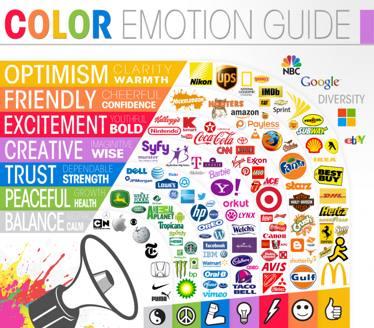
Graphic from the Buffer blog. “Why Facebook Is Blue: The Science Of colours In Marketing” by Leo Widrich
When it comes to getting people to click a button or sign up, it’s not a question of which colour is magic and makes it happen all the time. It’s a question of passive and active colours, of high and low contrasts, and of opposites.
Choose colour and contrast that is readable. Beautiful content that can’t be read is a fail.
Colour is a fascinating study, from both a theory and psychological standpoint.
From Newton, Goethe, Itten, Hering, Young-Helmholtz, Birren, or Müller (yes, there have been many theories on colour throughout history), the lowly colour wheel has been considered and reconsidered again and again. The effect colour has on us and our behavior has been studied repeatedly.
This fantastic article was first published by coschedule.com. The full article can be found here.