

Why it’s important to be mobile responsive
It has happened.
The time has come.
Smartphones have finally edged ahead of laptops as the preferred devices for connecting online in the UK, a report by Ofcom says.
The communications watchdog said 33% of Britons opted for smartphones as the device of choice in 2014, ahead of 30% who preferred laptops.
Ofcom said the toppling of the laptop was a “landmark moment”.
What does this mean for you and your business website and why should you care about responsive design?
With UK adults spending nearly two hours a day on average using the internet on their phones it’s imperative for your business to be mobile responsive.
As a website owner you should want your customers and clients visiting your website to have the best possible experience.
Essentially this can be done by optimising the layout of the content and adapting the content that is shown.
When we optimise the layout of the content we give mobile devices the ability to read the website in a different way.
You can see from these images how the website alters itself depending on the size of the screen on which it’s viewed. On a desktop there’s plenty of space to have everything on show and inline.
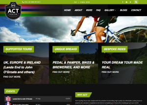
As we move to a smaller device like a tablet we ask the device to read the website in a different way. Instead of our tabs showing inline they now sit on top of each other and our navigation menu has changed to what is often referred to as a ‘Hamburger’ navigation menu.

Finally on our mobile phone device we have removedthe image of the cyclist so that we can put more direct content onto the page. We also do this to reduce loading times for mobile devices. This makes it much easier for the user to read content on the website and provides a friendly user experience.

When we adapt the content that is shown on a website we think about the situation that the client/ customer might be in. If you run a plumbing business and a potential customer is browsing from a desktop computer they probably aren’t in a hurry to have work done. They probably want to browse your services, look up prices, see what sort of work you’ve been doing and maybe check your testimonials.
If the same potential client is browsing from a mobile device it might suggest they’re under a sink, one hand plugging a leak and the other hand on their phone looking for your emergency contact details.
This is not to say everyone searching for a plumber on a mobile device is in an emergency but an example of what we mean by adapting the content.
The best thing about a mobile responsive website is that you get all this without having multiple versions of the website to maintain. everything is stored on your website and depending on the screen size the website will tell the device to display the information differently.