
What is Responsive Web Design?
You may have heard us ask; “How can your visitors respond to you, if your website does not respond to them?” or; “Is your website responsive?”
You may have wondered…. what the heck is responsive website design?
Here we explain.
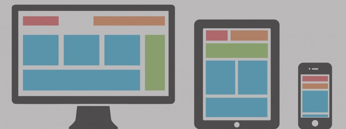
Responsive Web design is the approach that allows design and development to respond to the website user’s behavior and environment based on screen size, platform and orientation.
As the user switches from their laptop to iPad, the website should automatically switch to accommodate for resolution, image size and scripting abilities. In other words, the website should have the technology to automatically respond to the user’s preferences. This eliminates the need for a different design and development phase for each new gadget on the market.

“No more pinching and zooming, or clicking on the wrong link because your fingers aren’t small enough”
Take the Google Mobile-Friendly Test.
Is my website mobile friendly?
Why is it important?
As smartphone and tablet adoption rapidly increases, so does the importance of mobile-friendly websites.
Mobile sales have already overtaken desktop sales, and mobile Internet usage is predicted to overtake internet usage in 2015. It is only logical that mobile search will overtake desktop search at some point in the near future as well.
Since 67 percent of users claim they are more likely to purchase from a mobile-friendly website, companies that rely on SEO are wise to begin making the transition to mobile-friendly websites, and responsive web design specifically.
5 reasons to bump it up your priority list
Reason 1: Reduced management costs
If you currently have a mobile and desktop site, you’ll be managing content in two places. With a responsive site you only need to update content once, saving time and effort on website management.
Reason 2: Google will thank you
Google has now said they will start penalising websites which aren’t responsive. Think of the impact on your SEO rankings and organic traffic. Need we say more?
Reason 3: You’ll be future-proof
Whatever device next hits the shelves, your website will adjust the content and layout to respond to these new devices. One thing to bear in mind is that if users of a specific device really increase, you’ll want to test whether you’re showing the right content and have the best layout for that particular device.
Reason 4: Faster page loading
Because responsive websites are built using one set of code, they’re much faster to load pages. This is because content is tailored for different devices, meaning it will only load the content you choose to be shown when the site is built.
Reason 5: Better usability
No more pinching and zooming, or clicking on the wrong link because your fingers aren’t small enough. Responsive makes it easier to navigate, and quicker to find the information you need. Features like ‘click to call’ are particularly useful if someone is on a mobile and wants to call your business easily from their phone.
If you would like to learn more, or arrange a chat with our team about your website please get in touch